Nudge Community Builders
Building change, from the street up
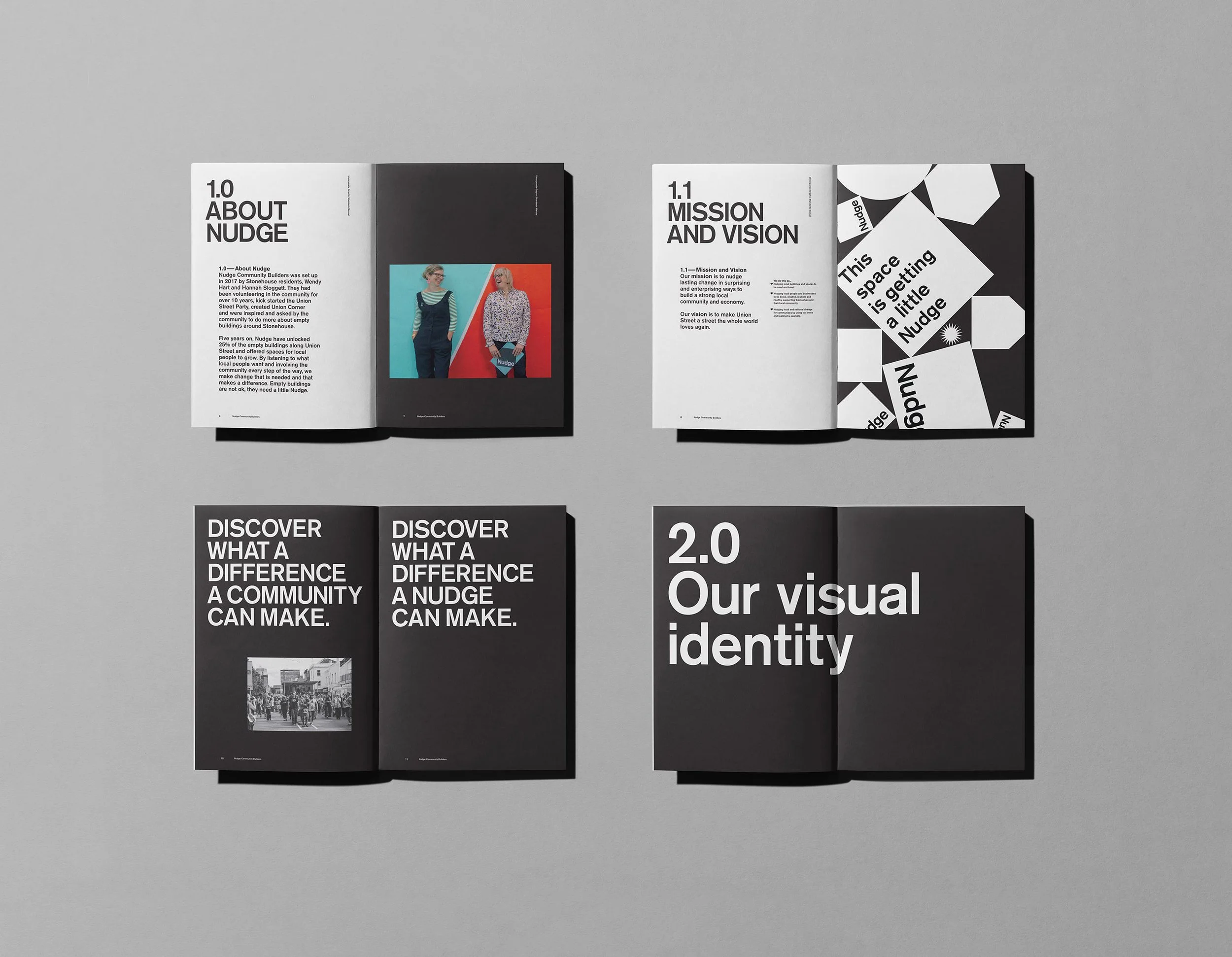
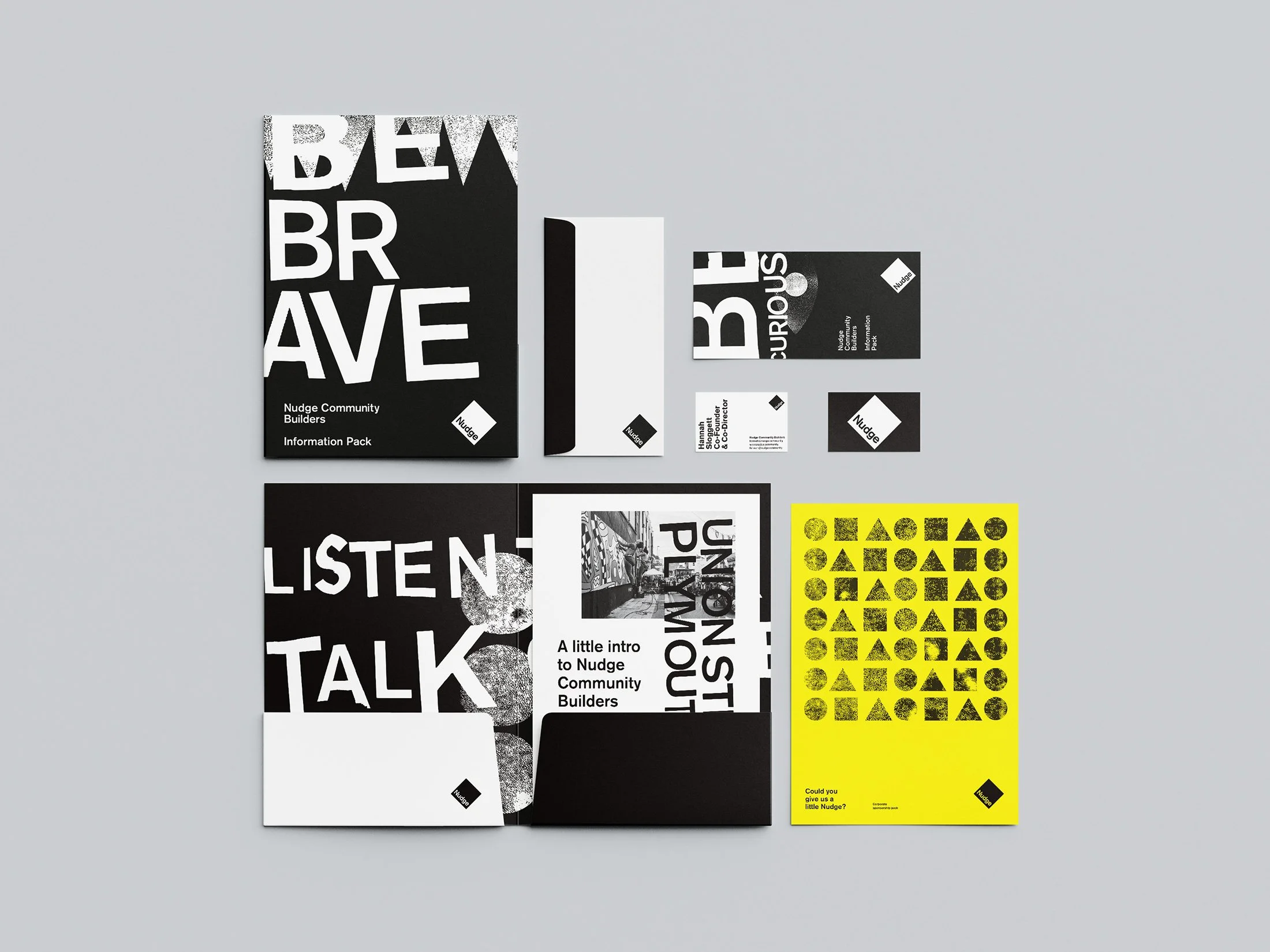
We’ve been working with Nudge Community Builders for over 16 years — from the very beginning of the organisation through to where it is today. We created the original Nudge identity — a simple, direct marque that has become synonymous with the organisation and its presence across the city. Something recognisable, unpretentious and grounded — much like the work itself.
-
Art Direction
Brand Strategy
Environmental Graphics
Graphic Systems
Ongoing Creative Support
Print
Signage
Supergraphics
Visual Identity
-
Big Ups
Notch Studio
Nudge Community Builders
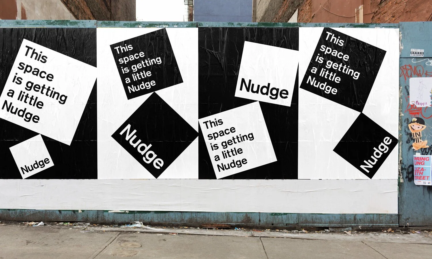
An identity that lives in the real world
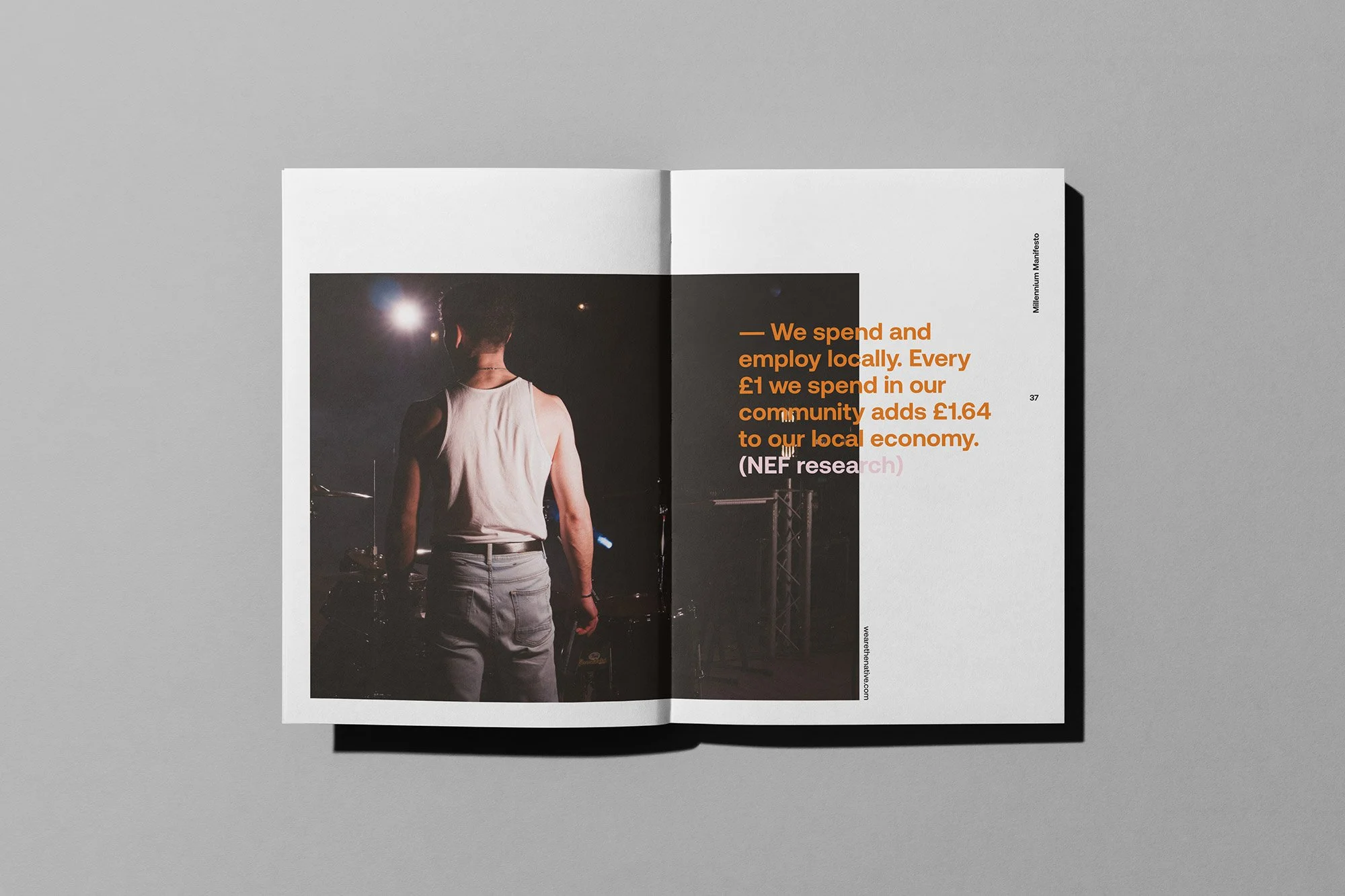
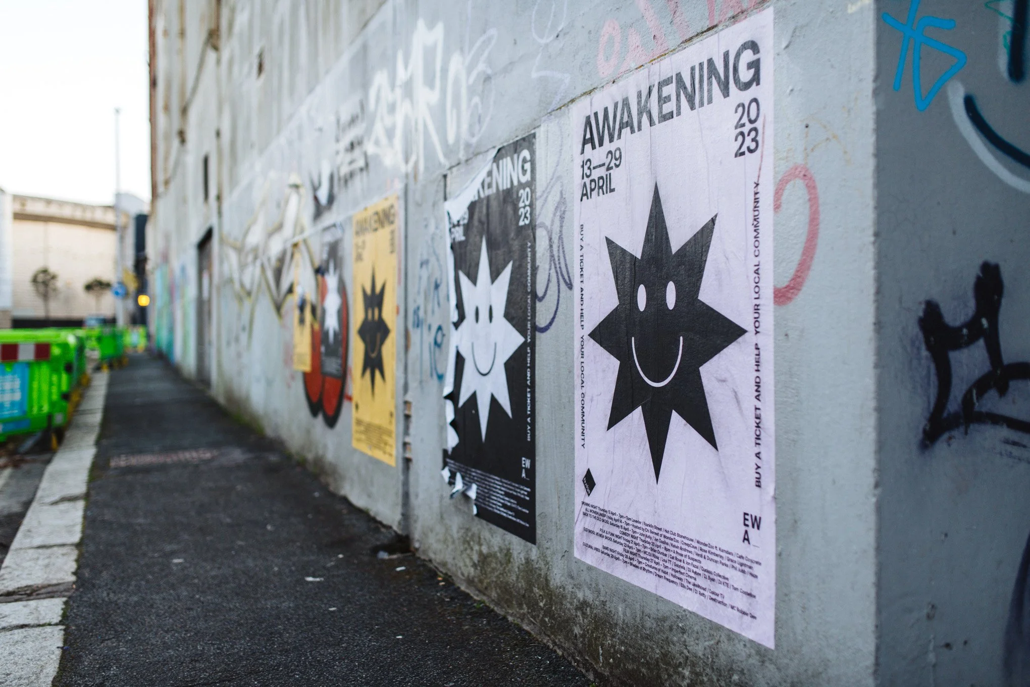
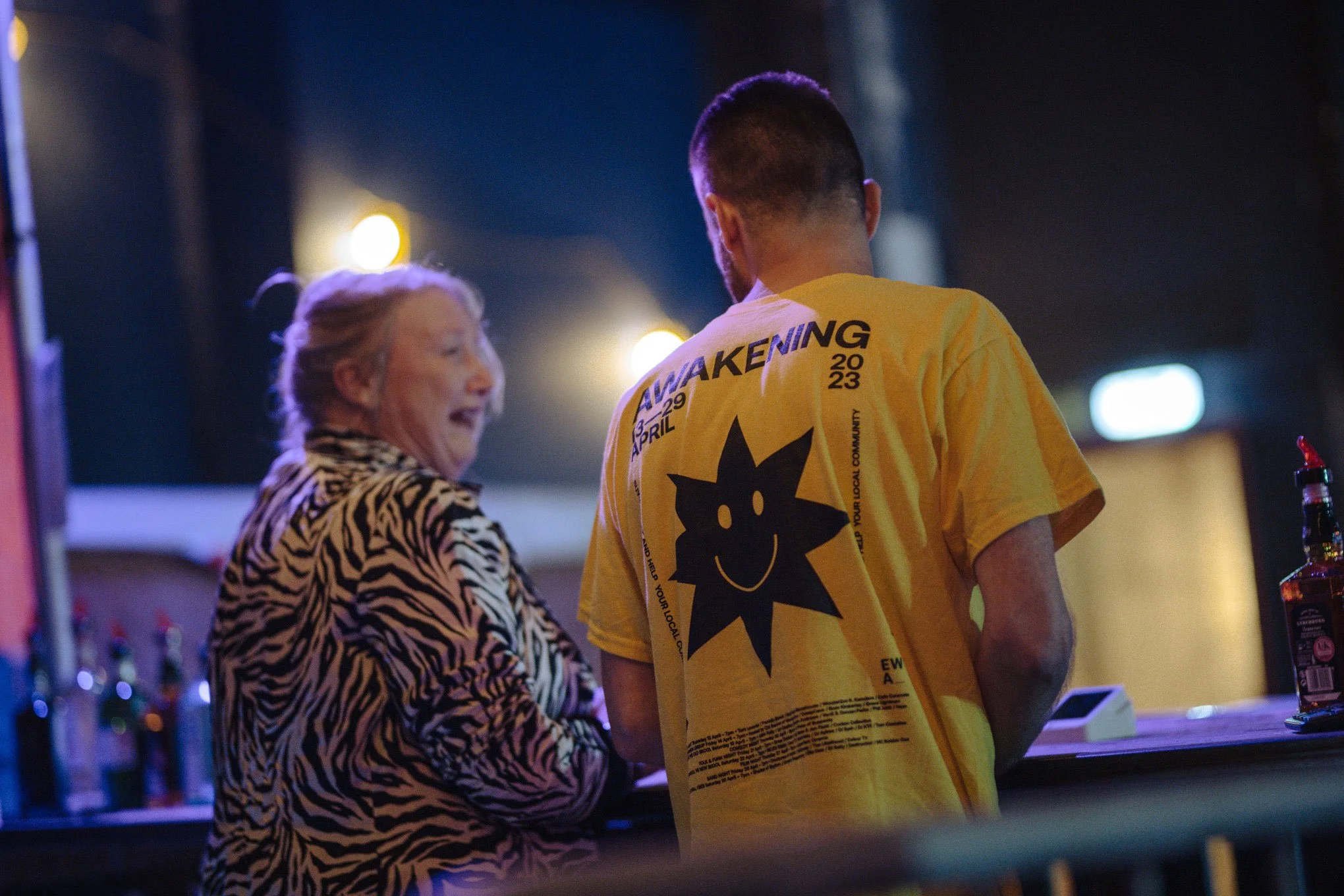
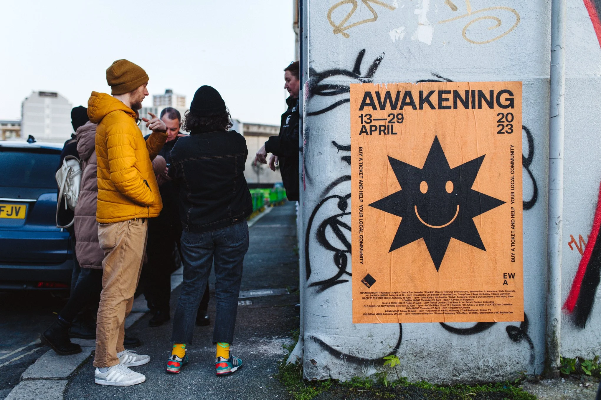
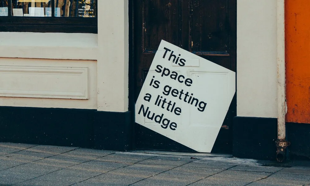
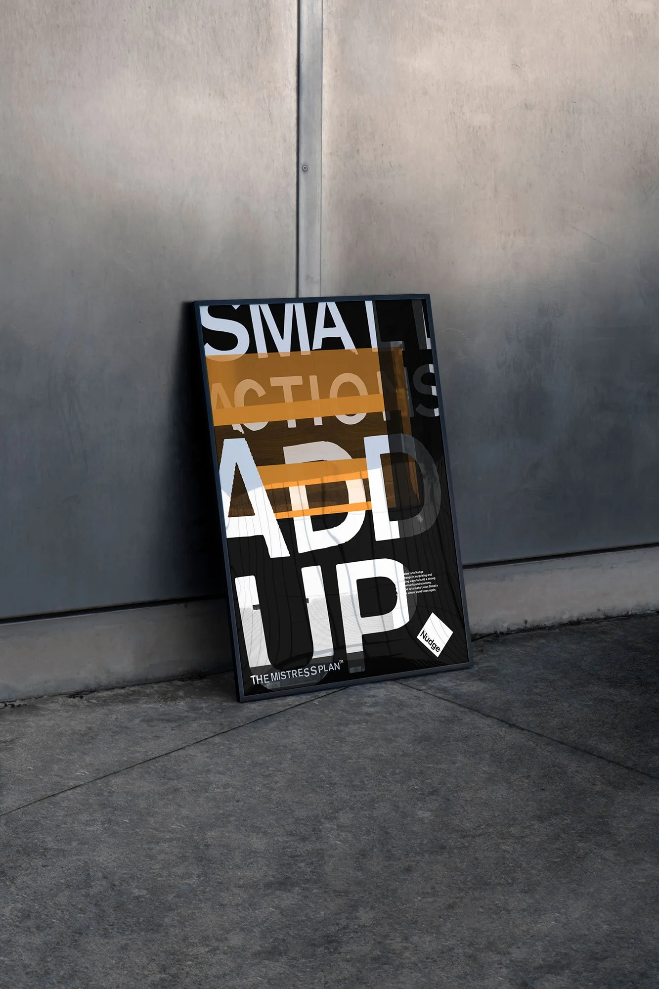
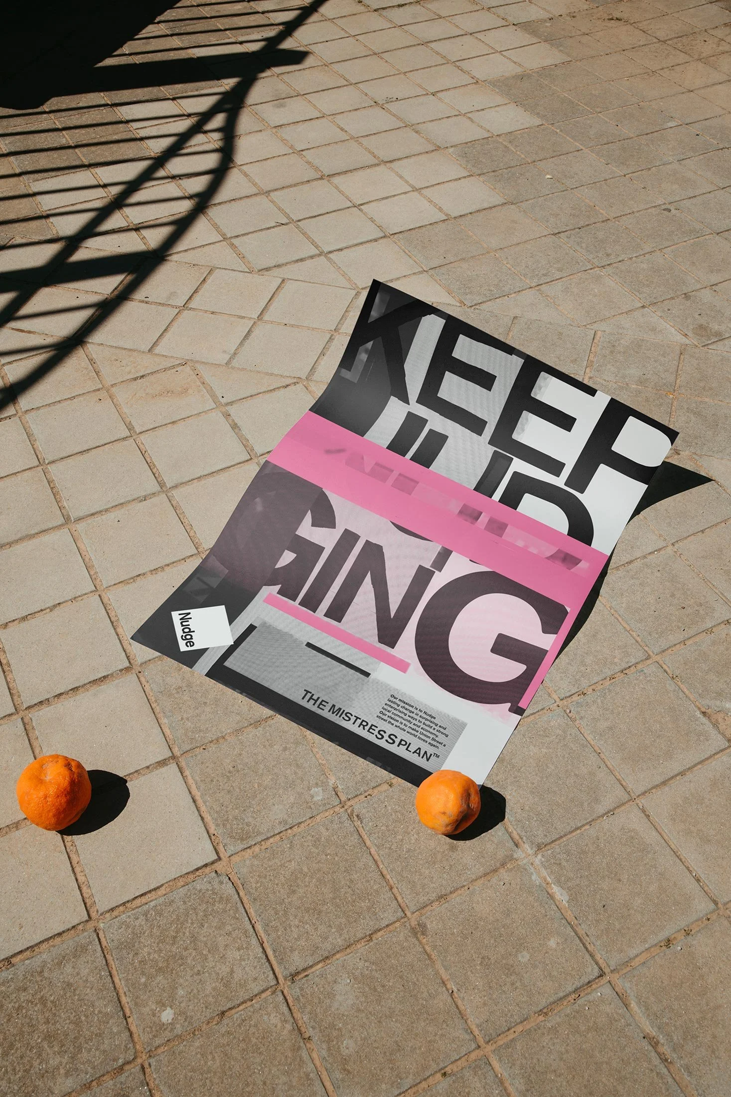
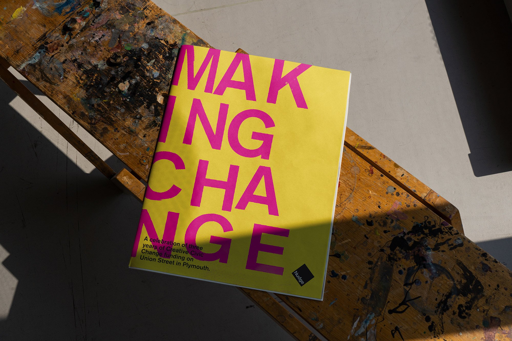
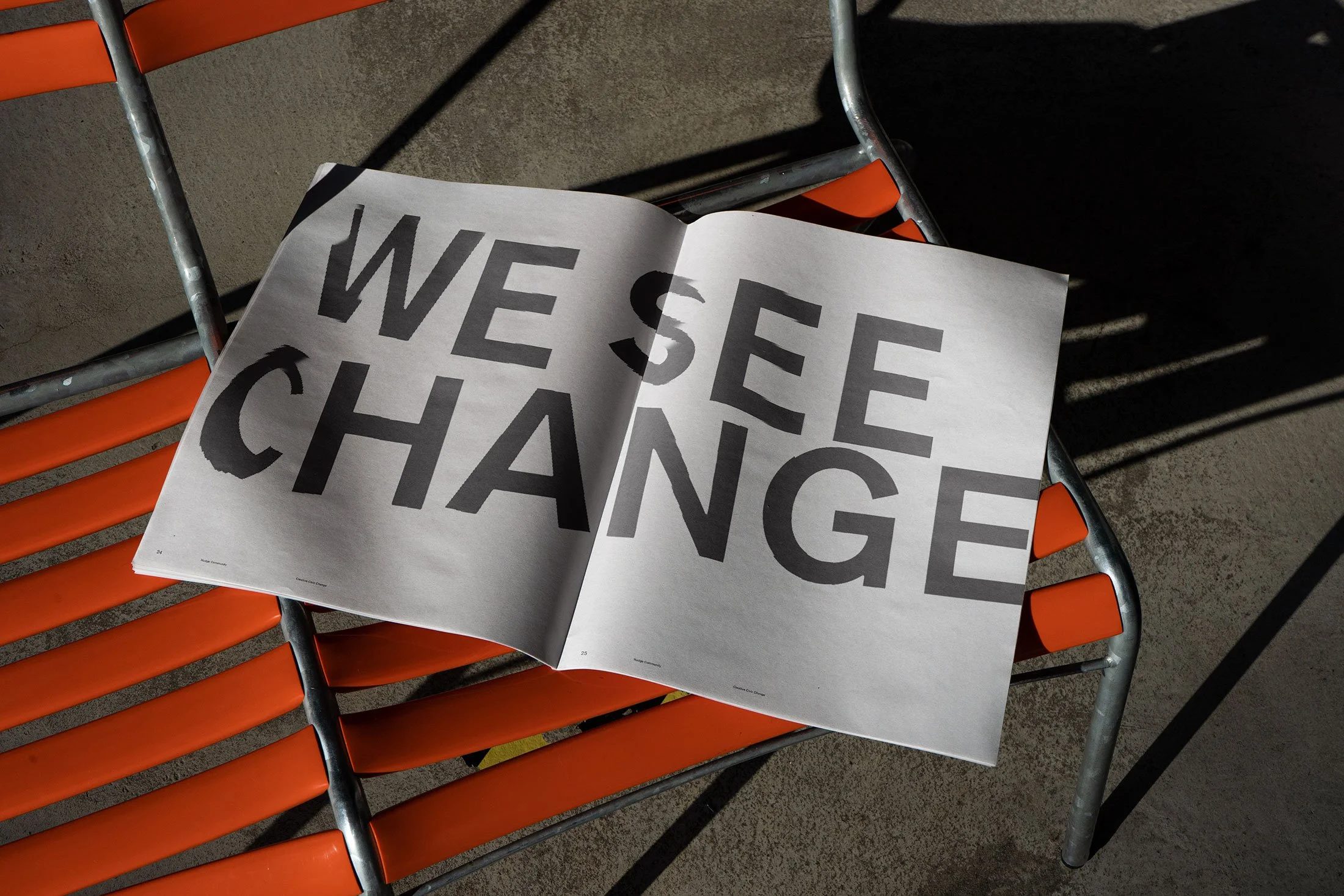
Since then, our relationship has grown alongside Nudge’s impact. Rather than a one-off project, this has been an ongoing partnership — supporting the organisation through every stage of its evolution. From individual buildings to wider initiatives, we’ve developed a series of distinct but connected identities — each one rooted in its specific place and purpose, but all clearly part of the Nudge ecosystem. The approach is intentionally grounded and high-impact: clear messaging, confident typography, and visual language that works in the real world — on buildings, signage, print and everyday materials.
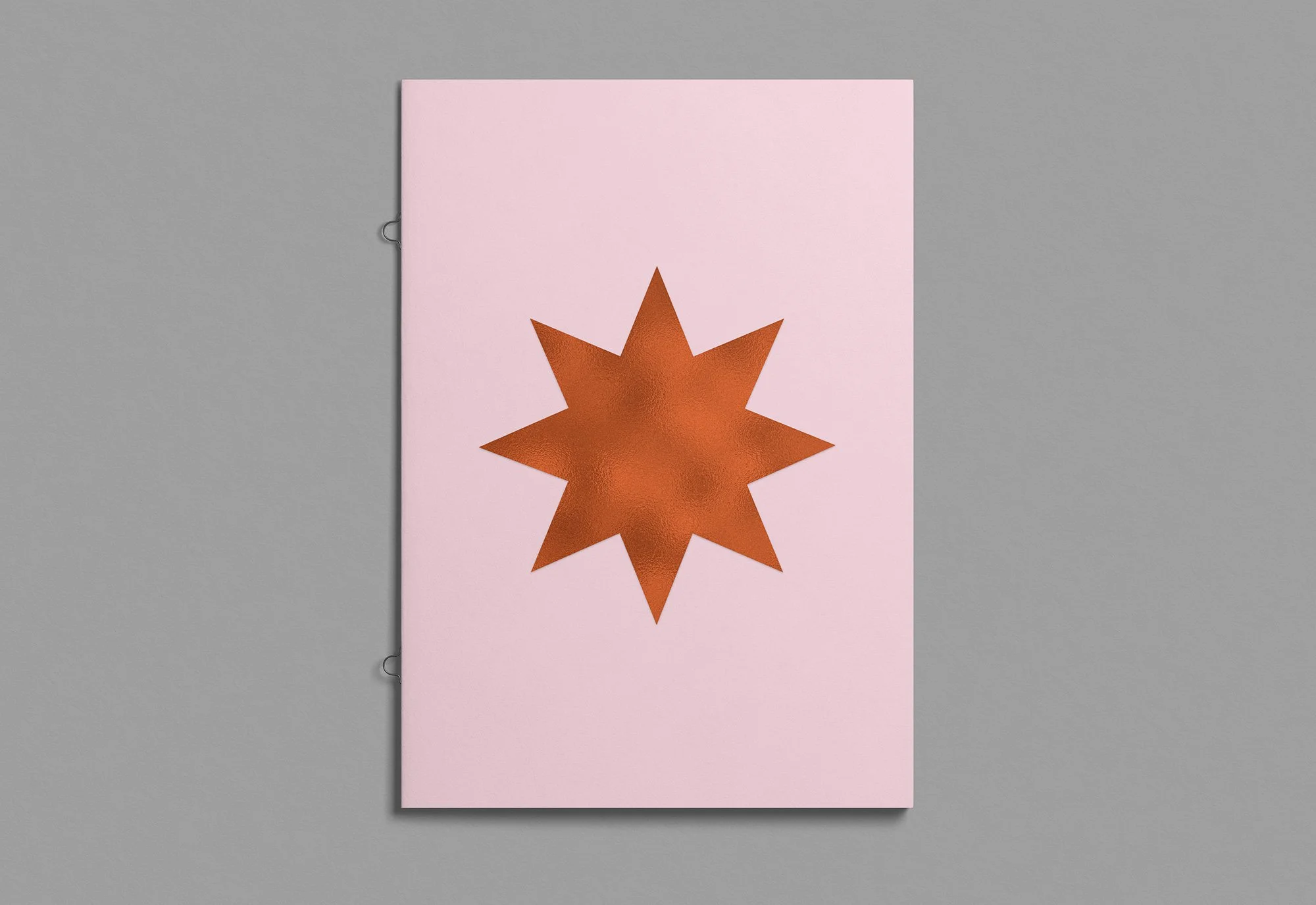
Shaped over time
What makes the work with Nudge different is its longevity. Over more than a decade, the brand hasn’t been reinvented — it’s been built. Layer by layer. Project by project.
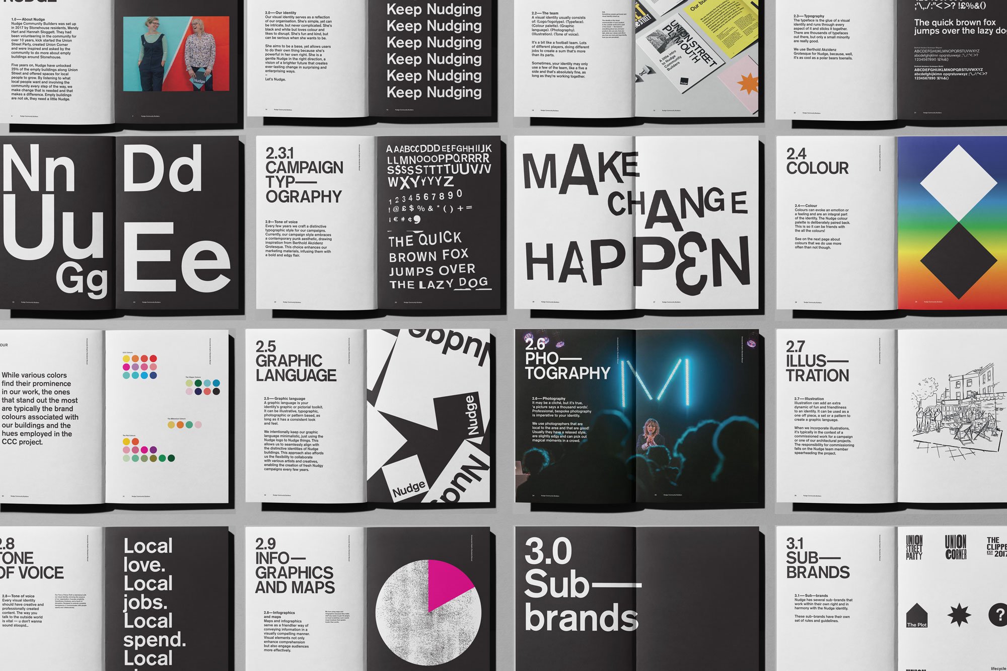
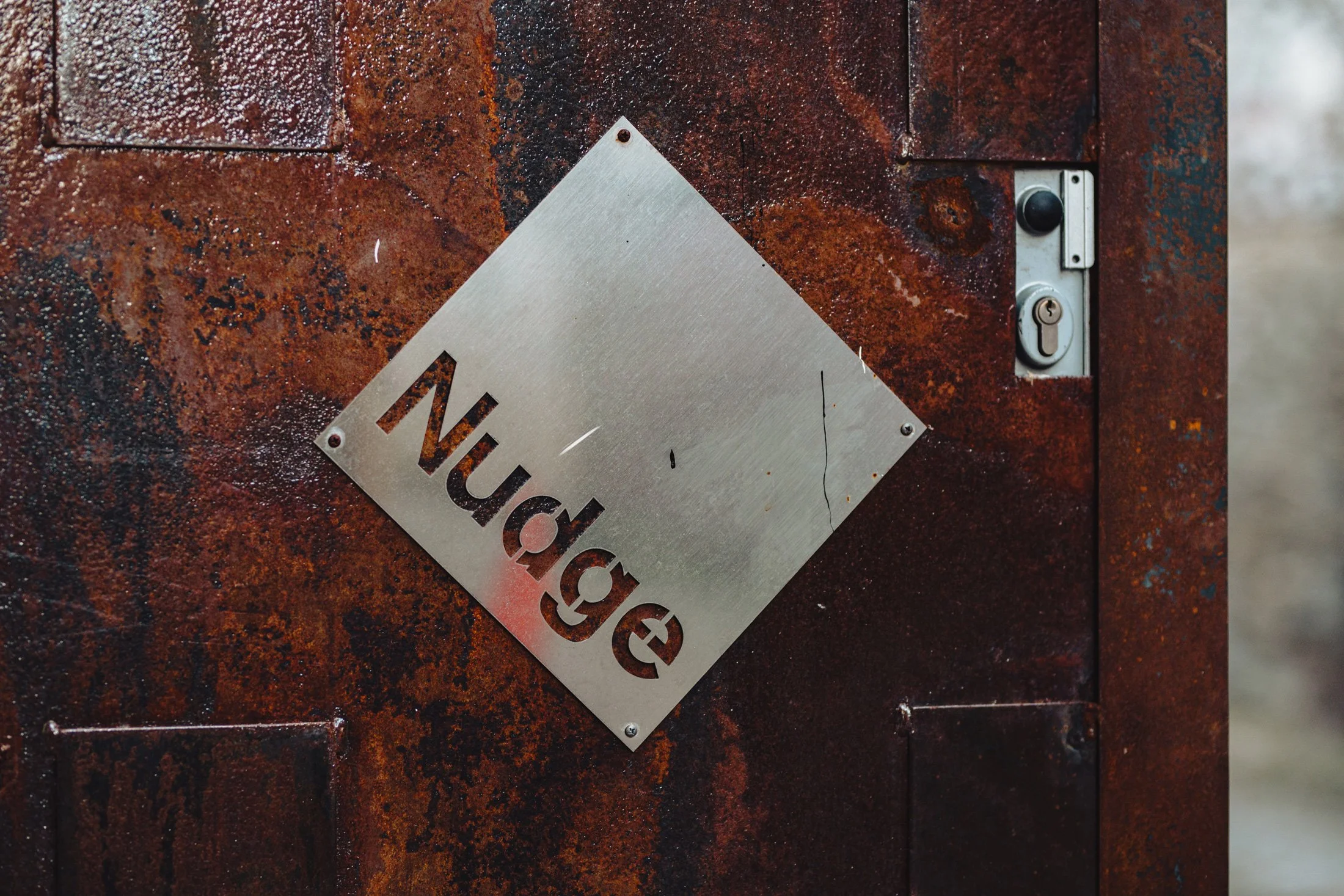
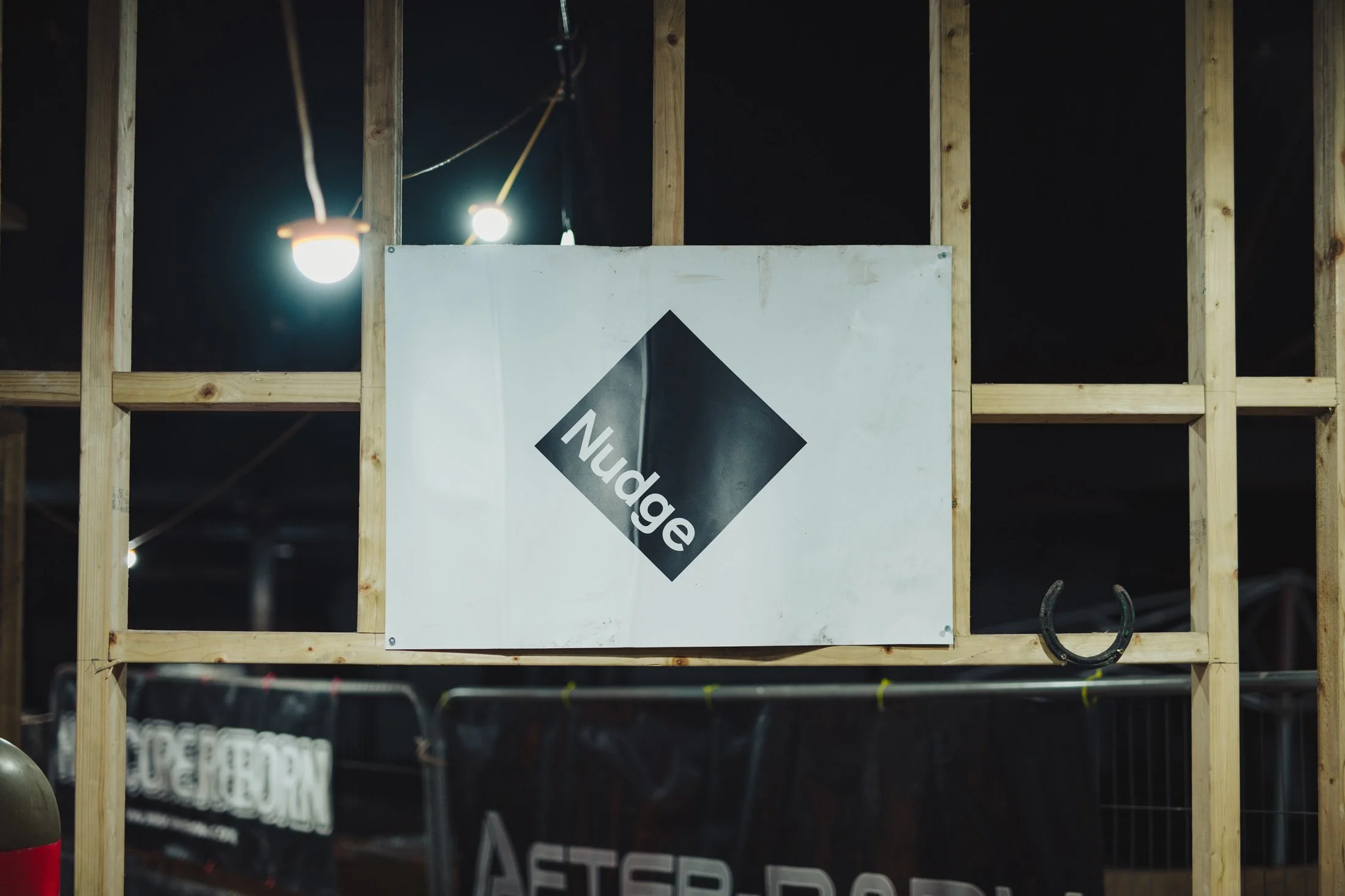
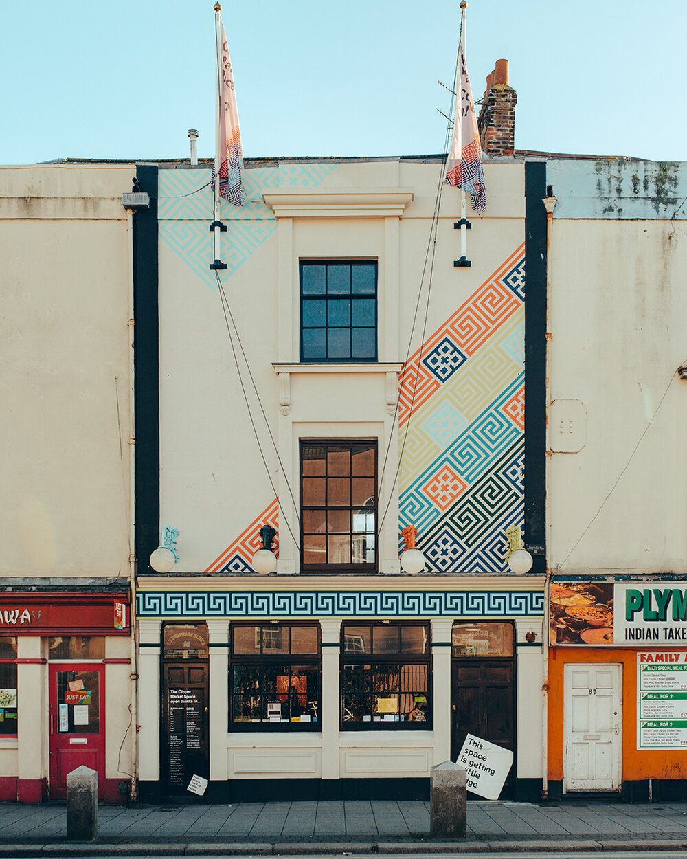
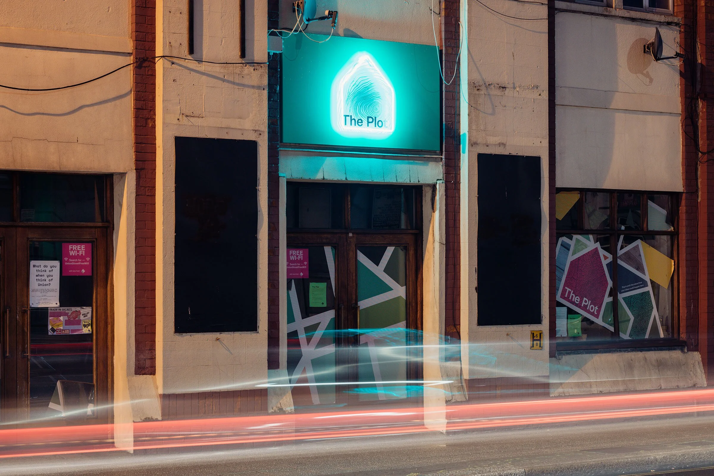
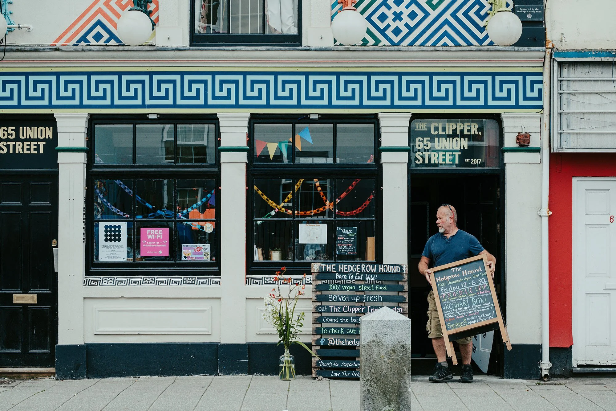
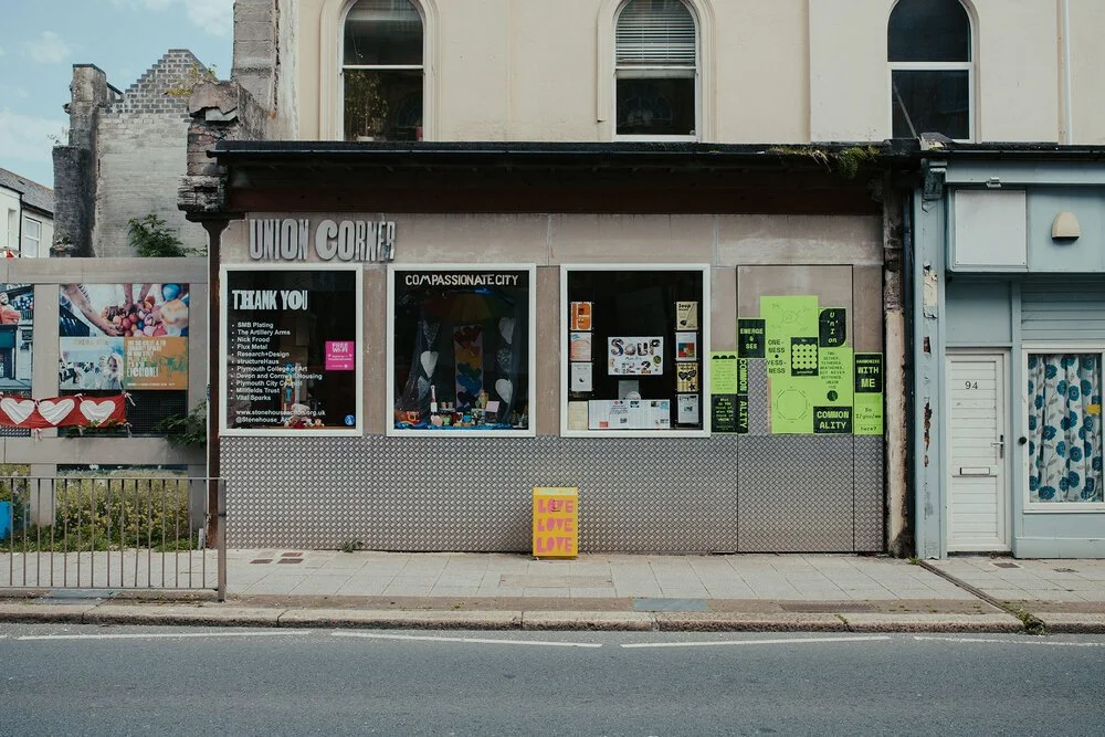
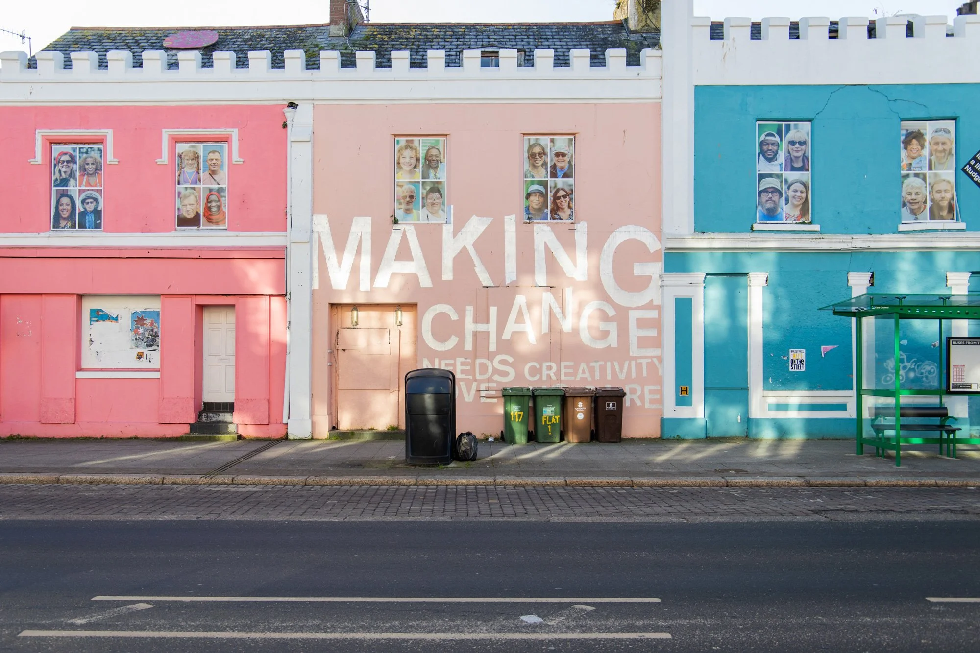
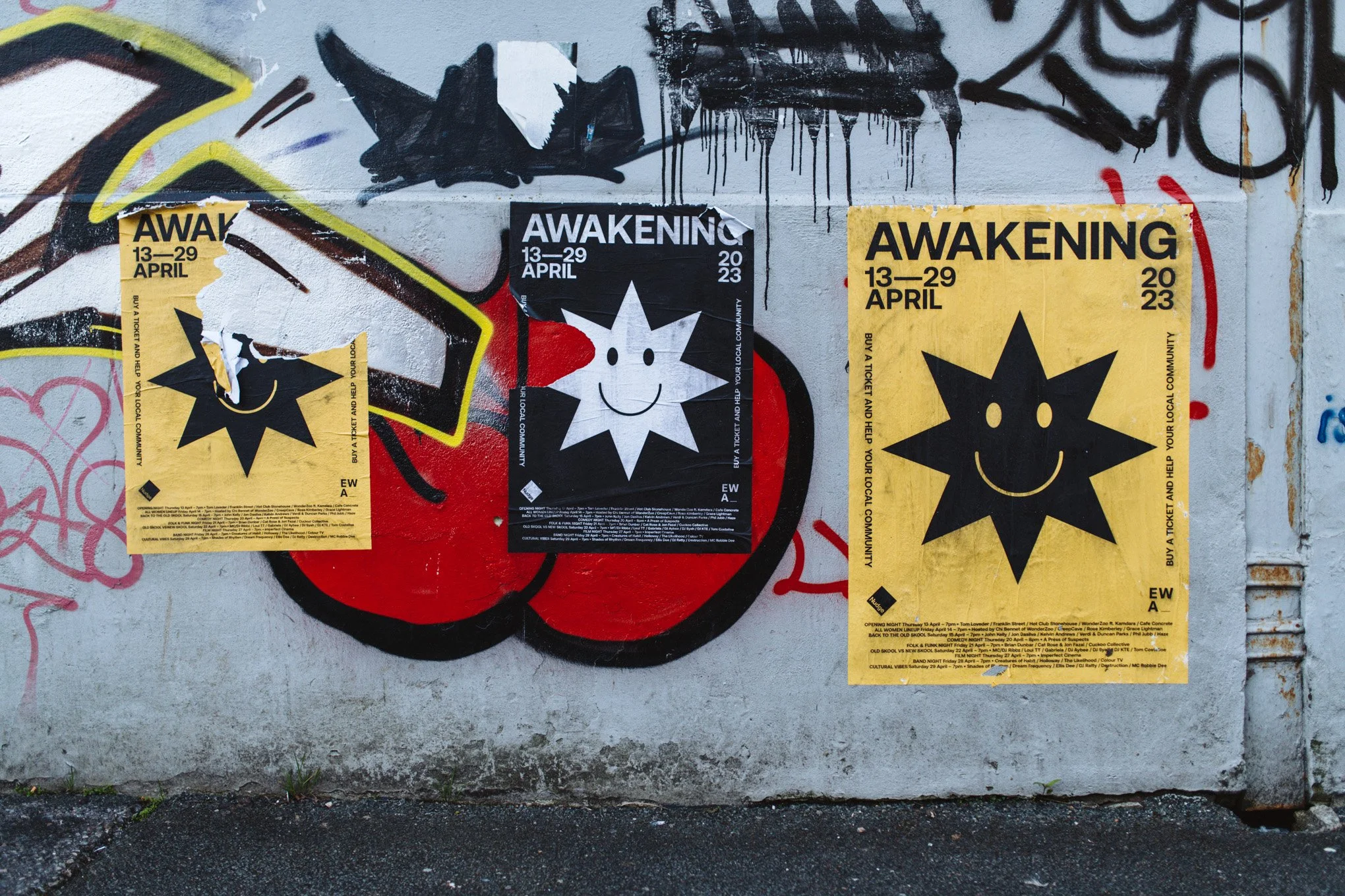
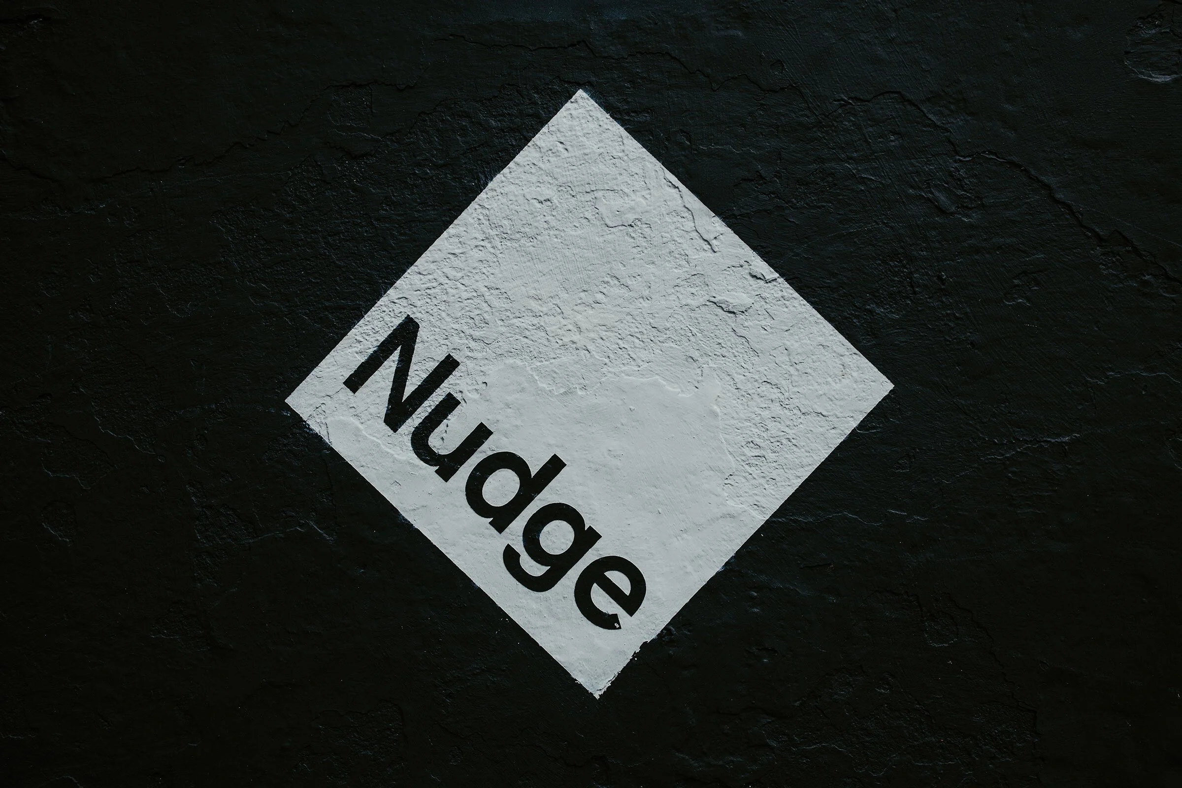
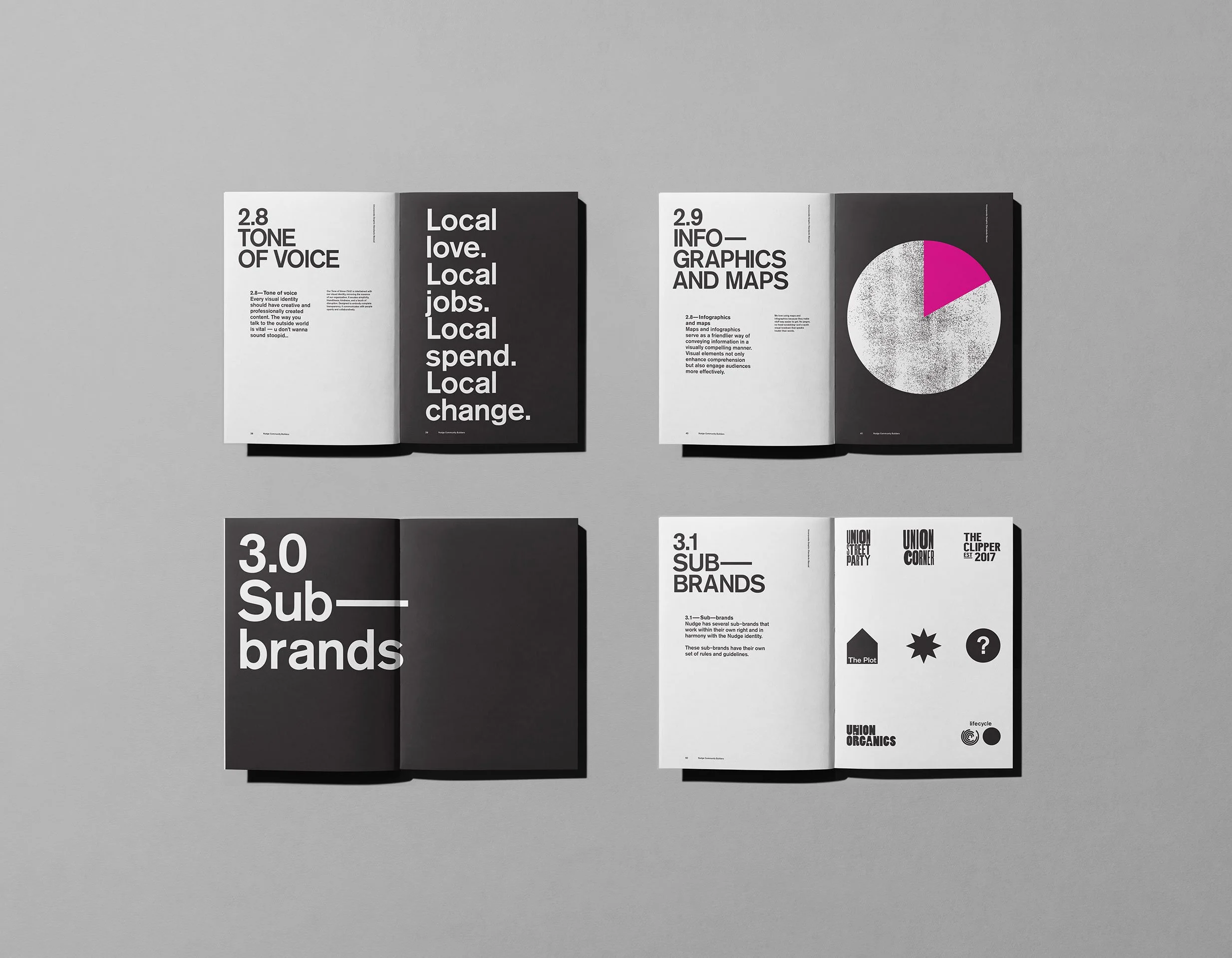
As Nudge continues to take on new spaces and create new opportunities, the identity grows with it — anchored by the ever-present square marque. A simple, recognisable symbol that carries across every building and initiative, creating a consistent thread as the organisation expands its footprint across the city.

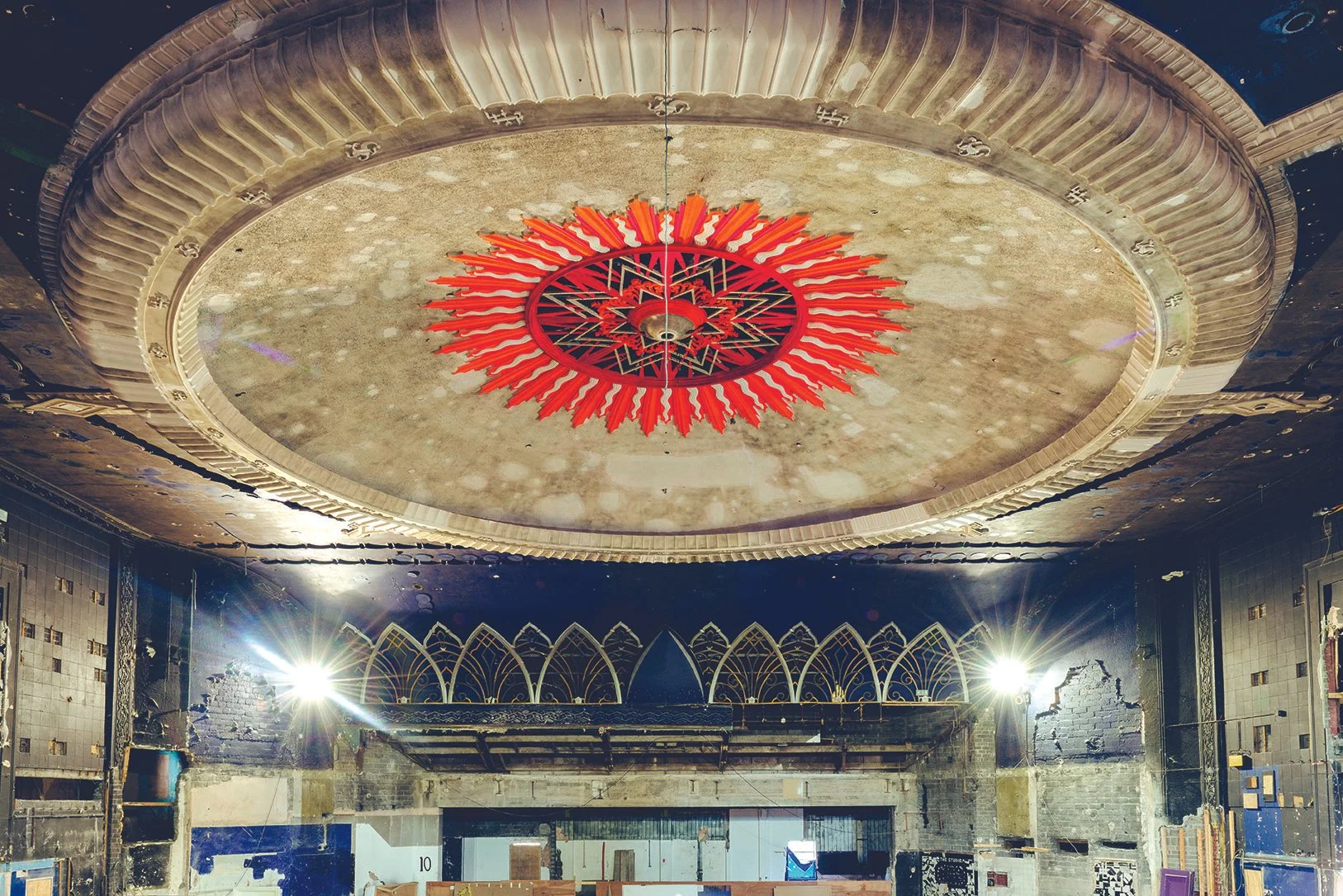
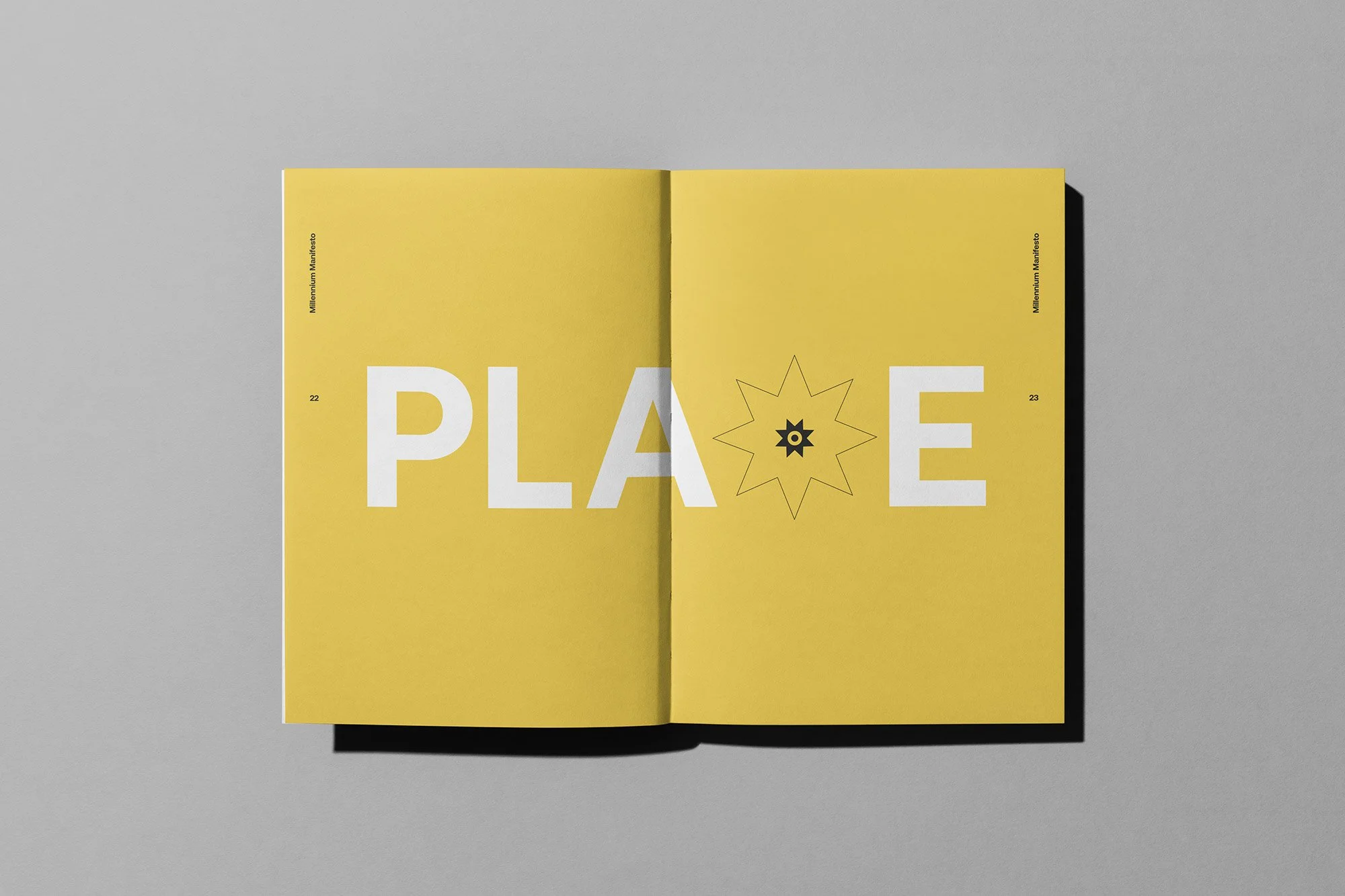
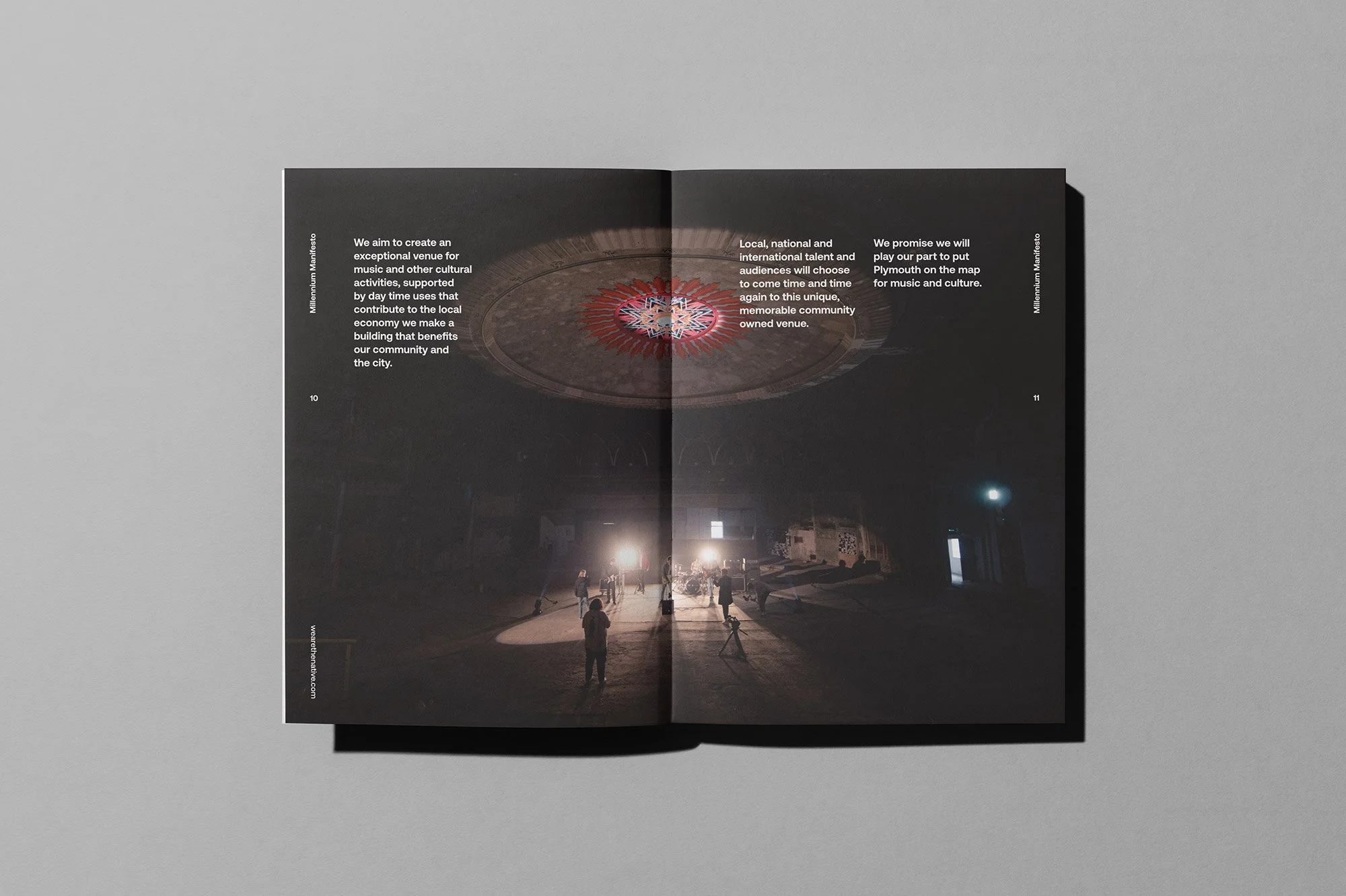
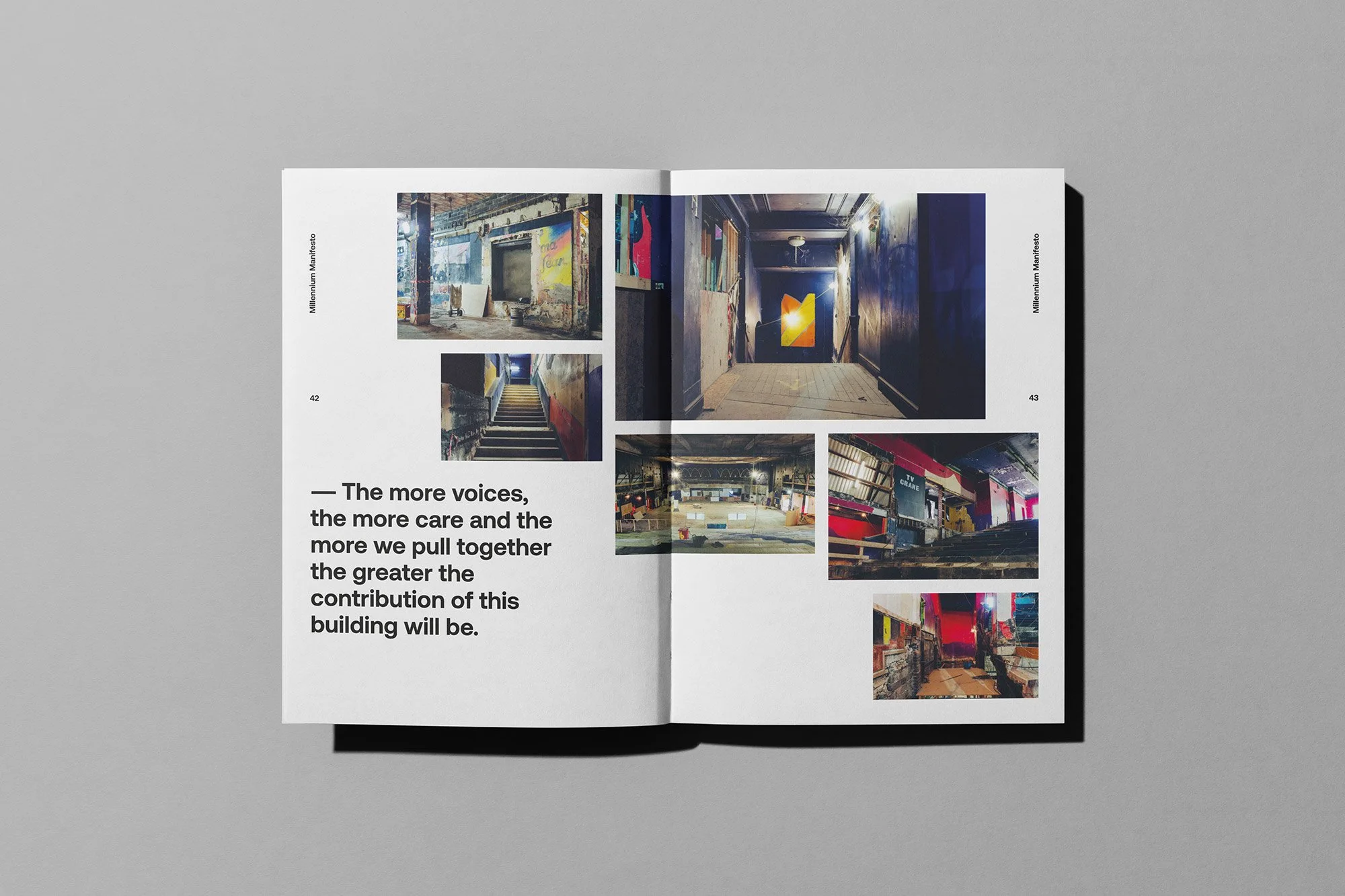
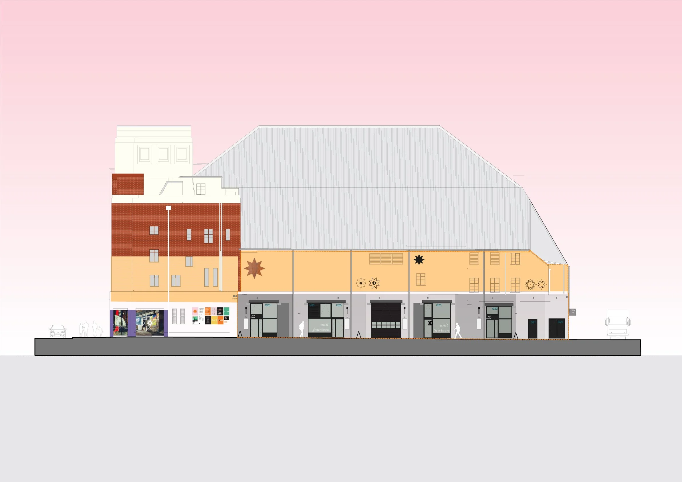
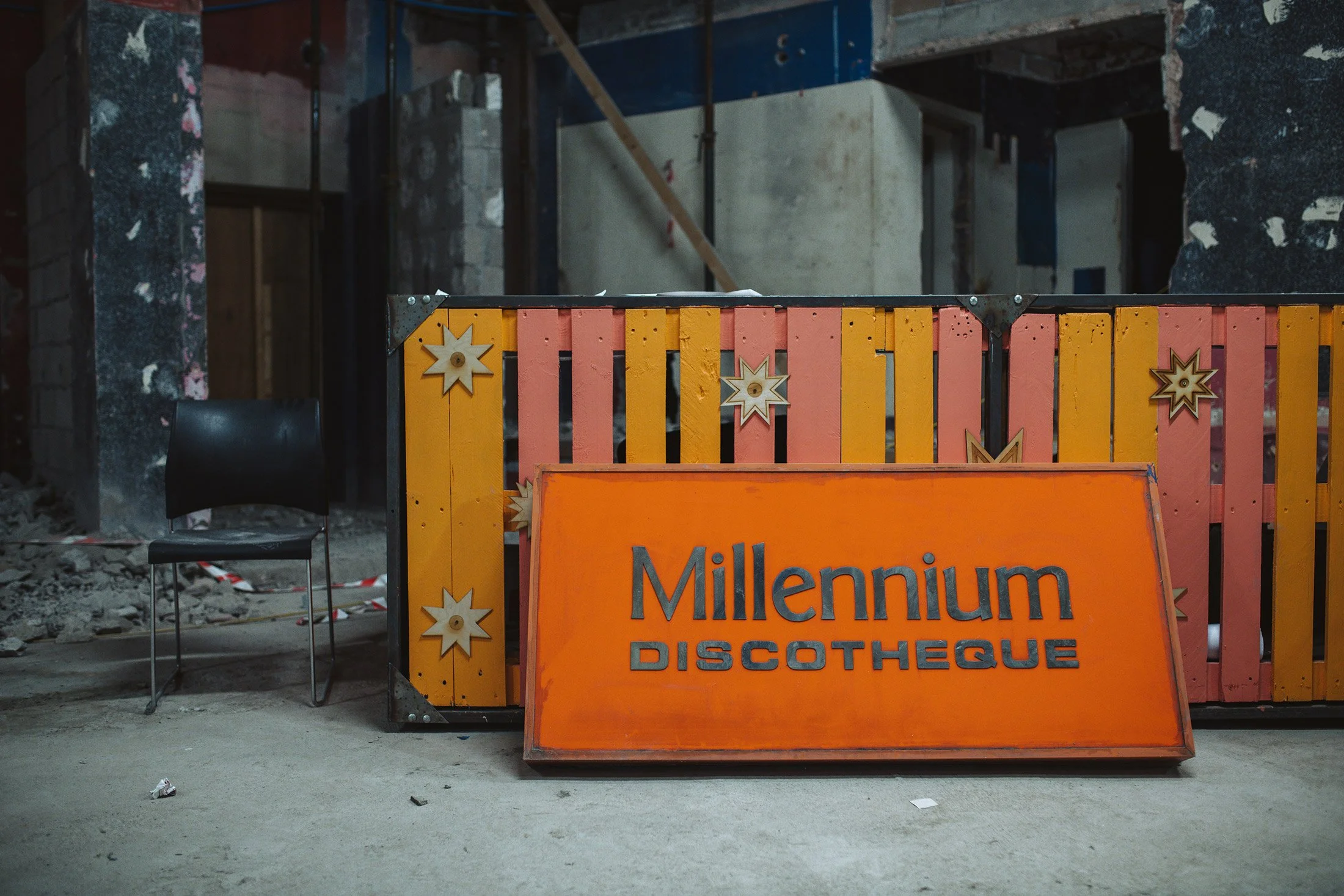
Millennium — A building brought back to life
A key part of our work with Nudge Community Builders has been supporting the transformation of the Millennium building in Stonehouse — one of the organisation’s most ambitious and visible projects.